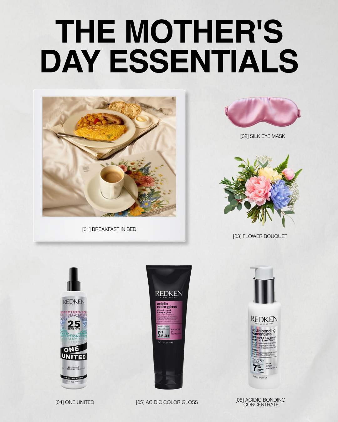
Redken Social Design
The Project: I oversee the delivery of static and carousel content monthly, spanning product spotlights, seasonal campaigns, and trend-responsive creative designed to educate and inspire Redken's audience.
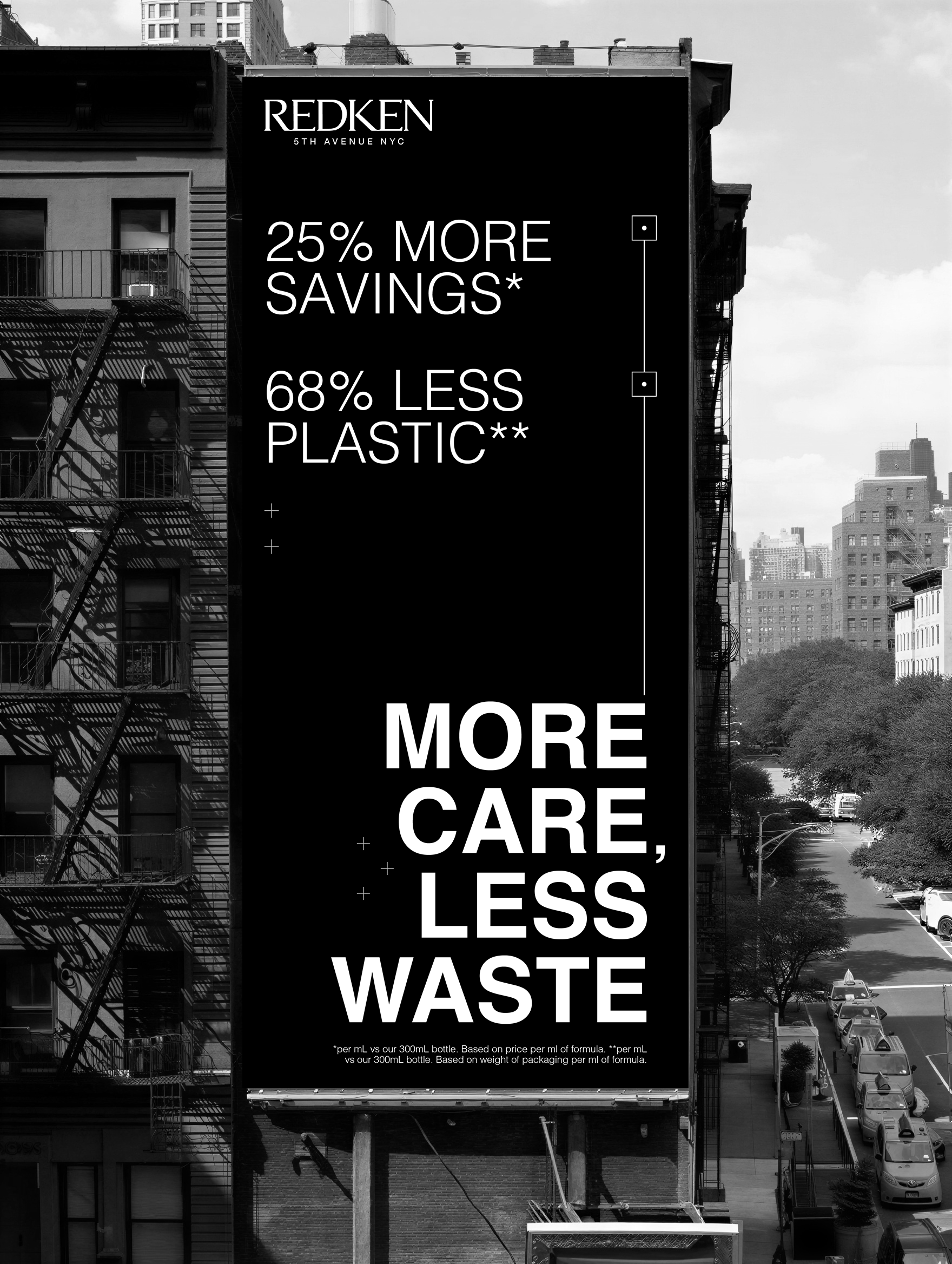
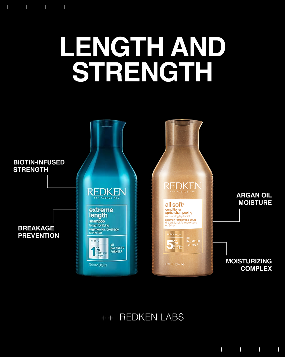
The Idea: I design high-volume social content, owning the full editing pipeline from first draft through final delivery. This focused on creating platform-tailored content to promote Redken's product portfolio and drive brand awareness, reach, and engagement across social channels. Our strategy leveraged trend-driven graphics, holiday-moment activations, and standard product promotion to keep the brand culturally relevant and visually compelling.
Featured: Work published across @Redken and @RedkenPro, contributing to content reaching 1.7M+ followers.
Client
Redken, L’Oreal
Role
Graphic Designer
AI Process
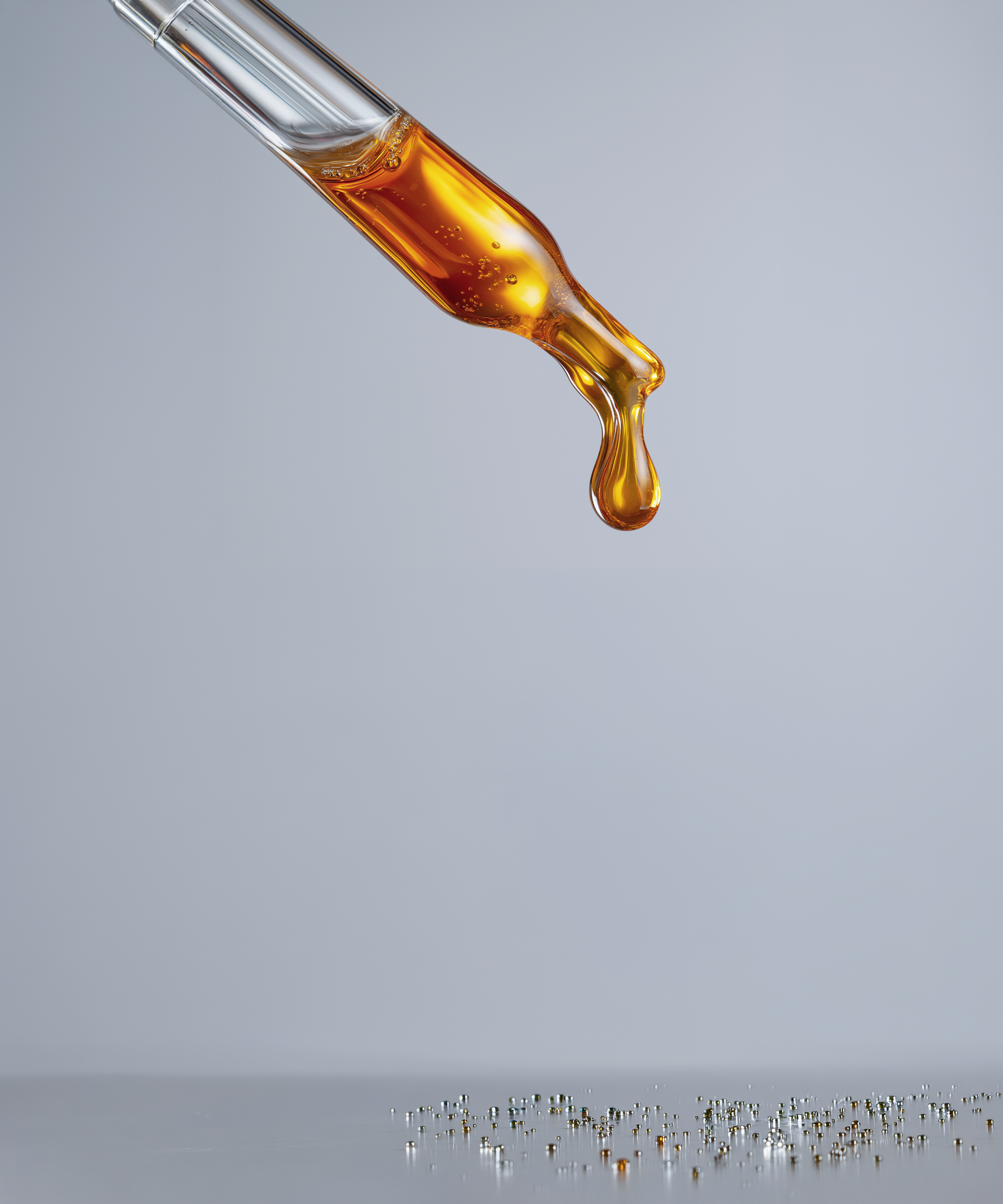
I use AI to streamline my design process, allowing me to work faster and more intentionally while keeping the product at the center of everything, whether the creative is rooted in a holiday, a trend, or an educational goal. AI is there to support my process and enhance my creative vision, but the thinking and direction behind the work is always mine. I also use it to adapt and retouch product imagery across different executions, keeping things feeling fresh without unnecessary repetition.

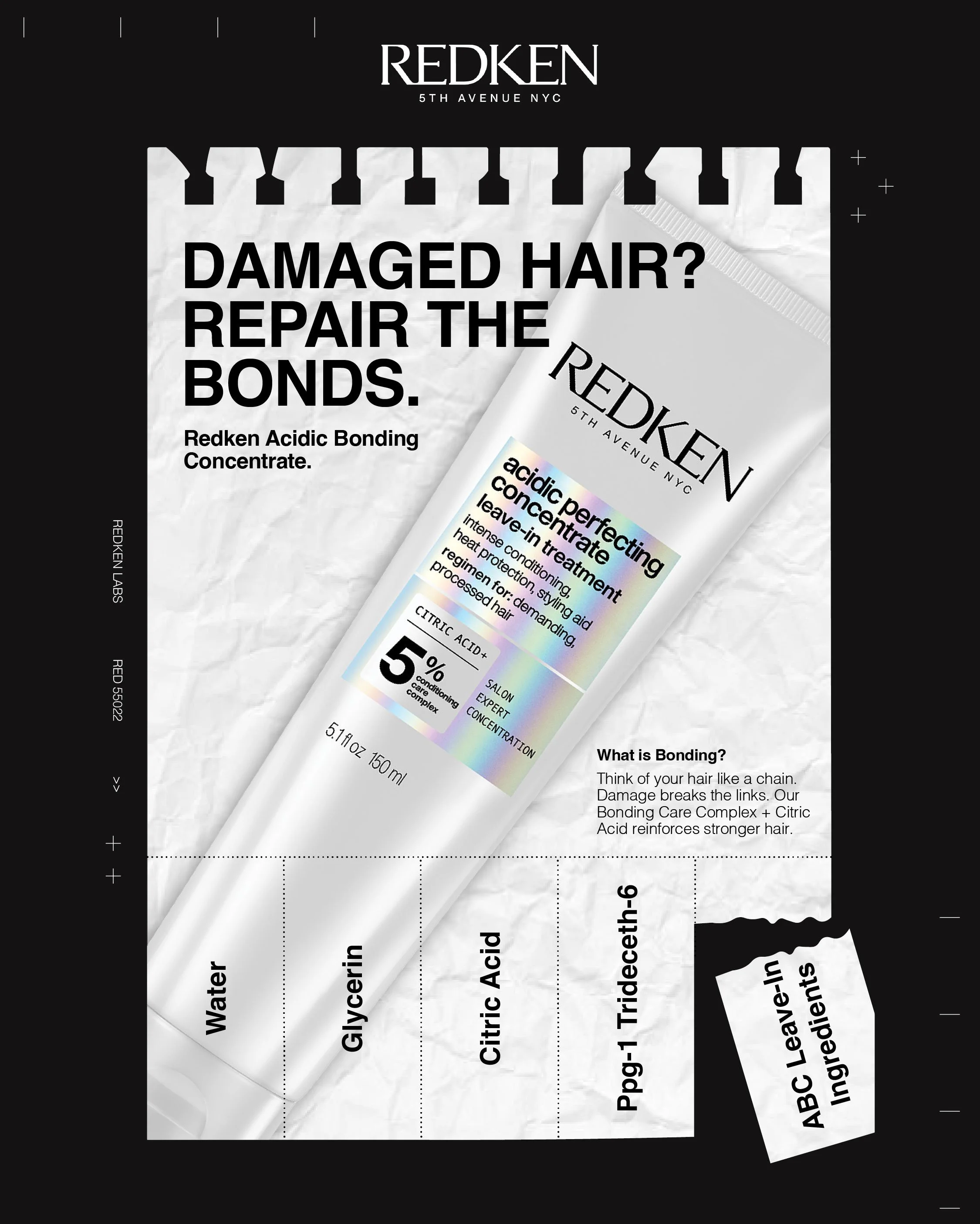
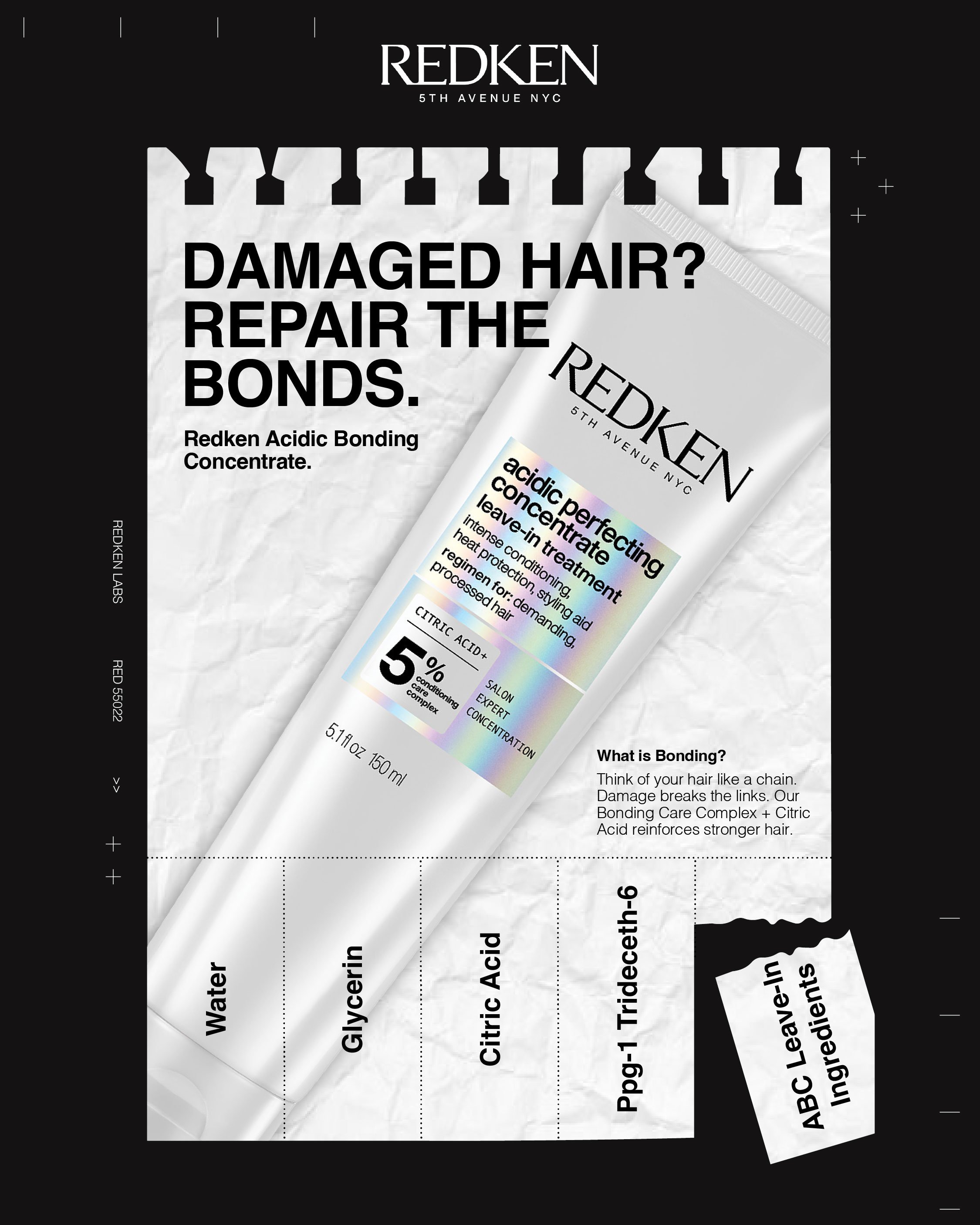
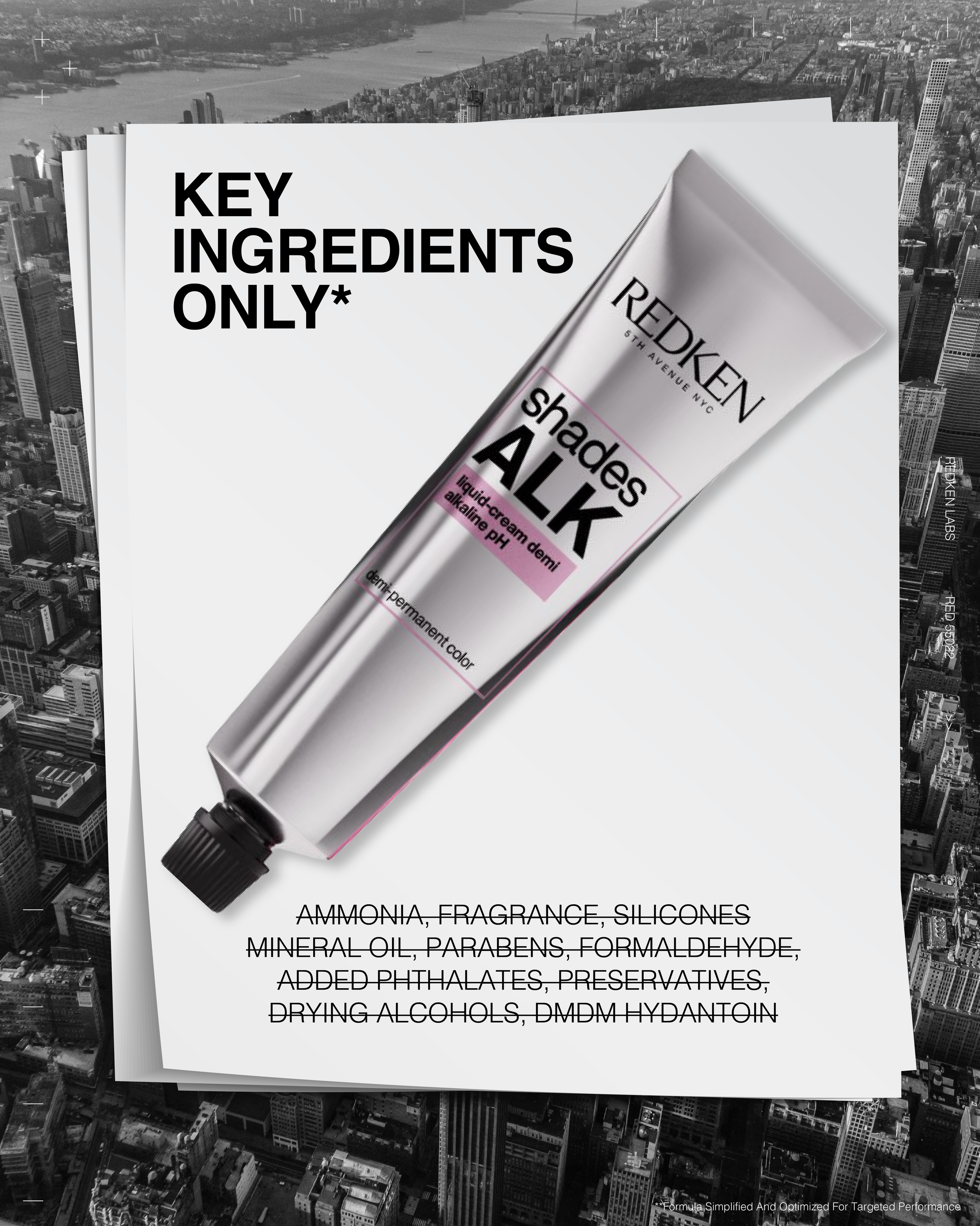
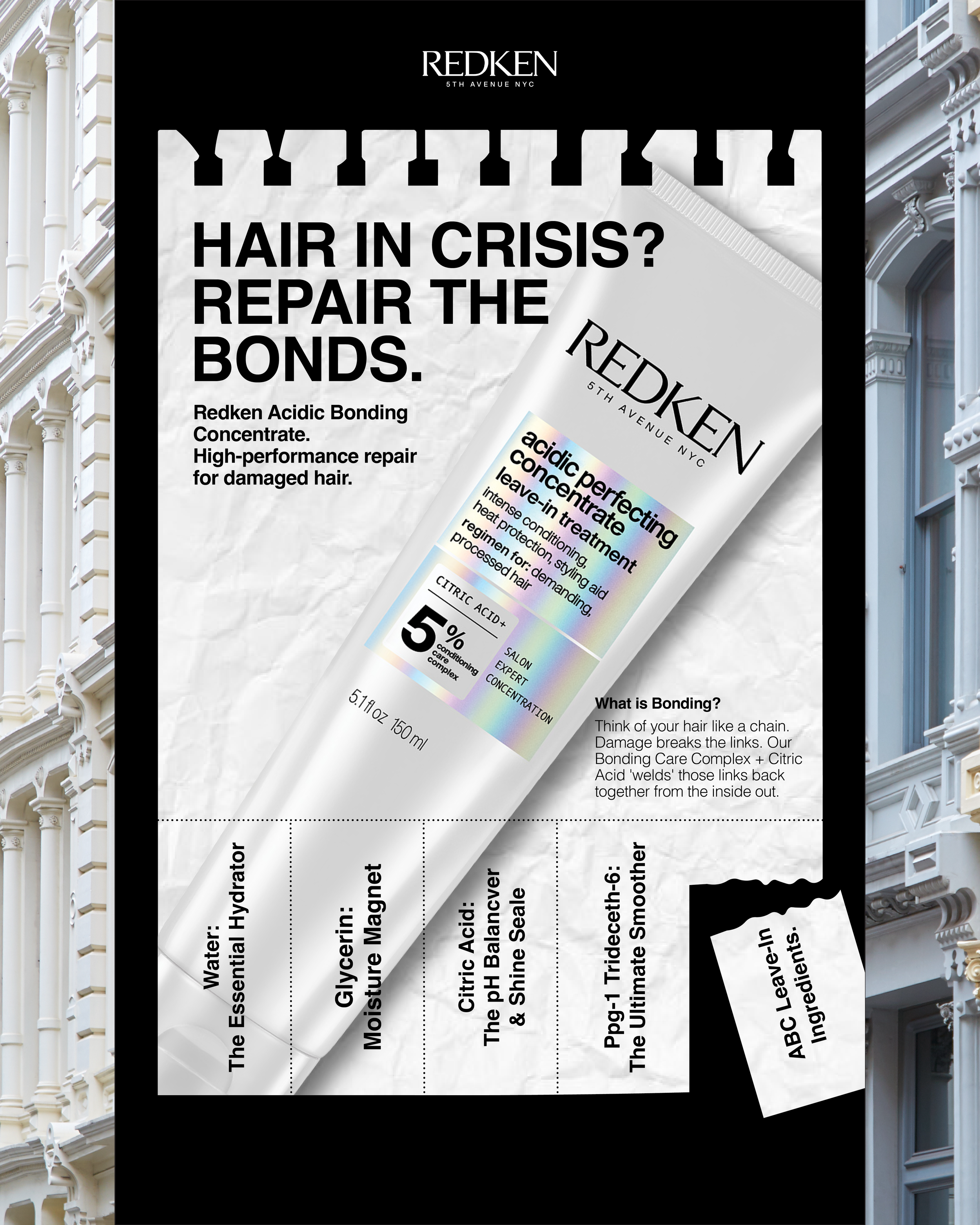
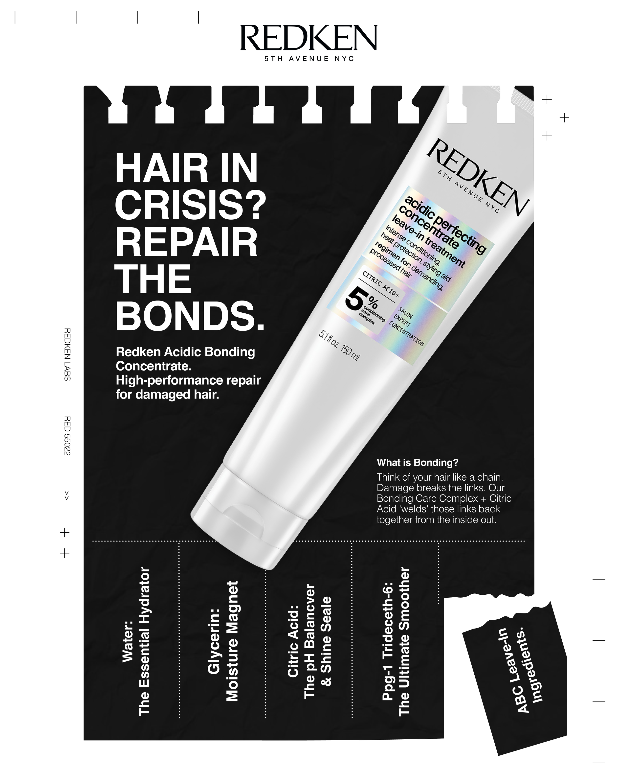
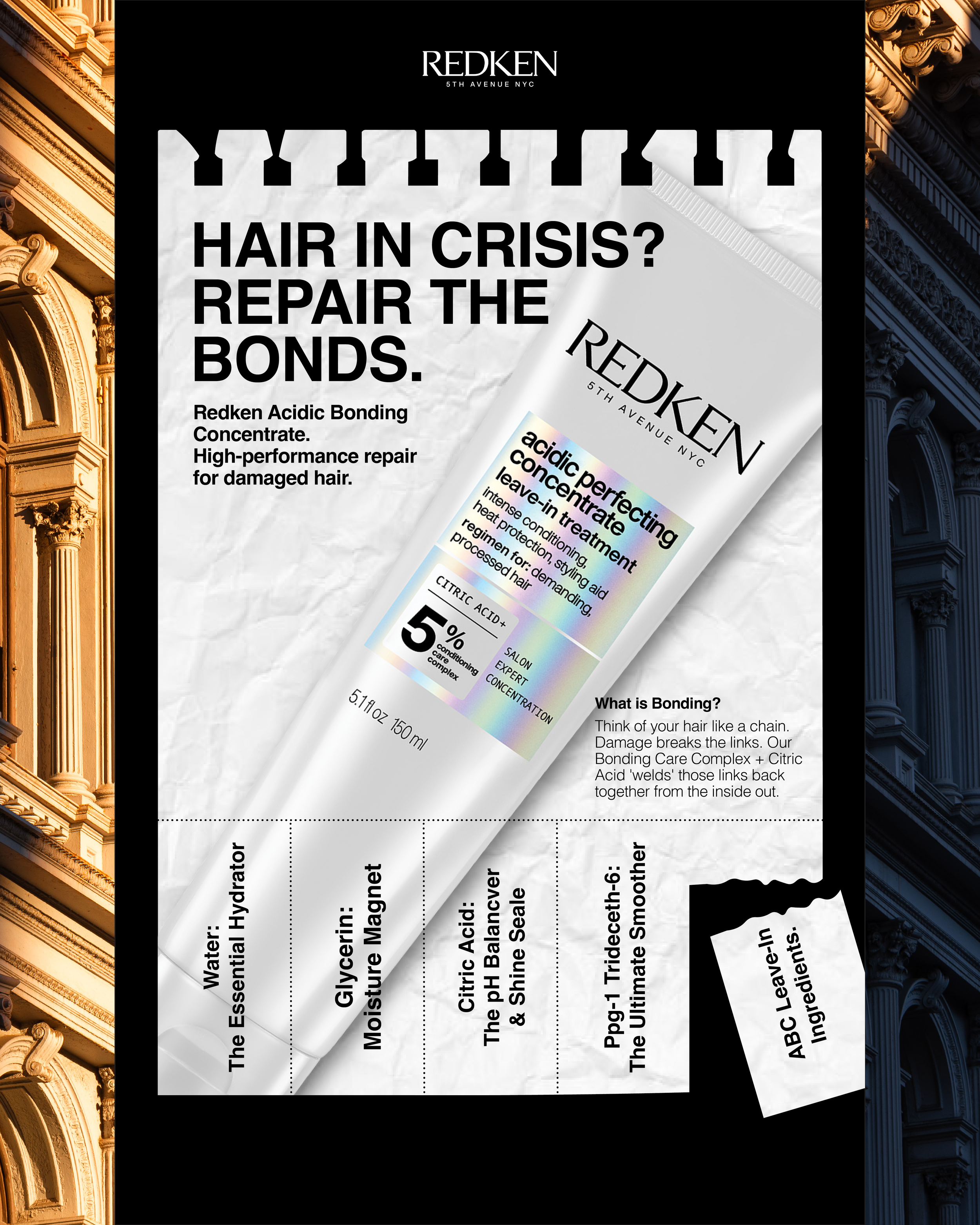
The Idea: Reimagine a classic black-and-white NYC street pole flyer as a “Hair Bond Emergency” notice. Instead of guitar lessons or roommate ads, the flyer spotlights the raw ingredients of Acidic Bonding Concentrate Leave-In Treatment, framing the science as urgent, accessible, and industrial-strength.
The Visuals: Wrinkled paper textures and bold, found-style typography elevate the street-flyer aesthetic while staying rooted in New York City visual culture. The product is integrated seamlessly into the composition, balancing gritty authenticity with refined brand design.
Damaged Hair? | NYC Street Flyer
Previous versions.
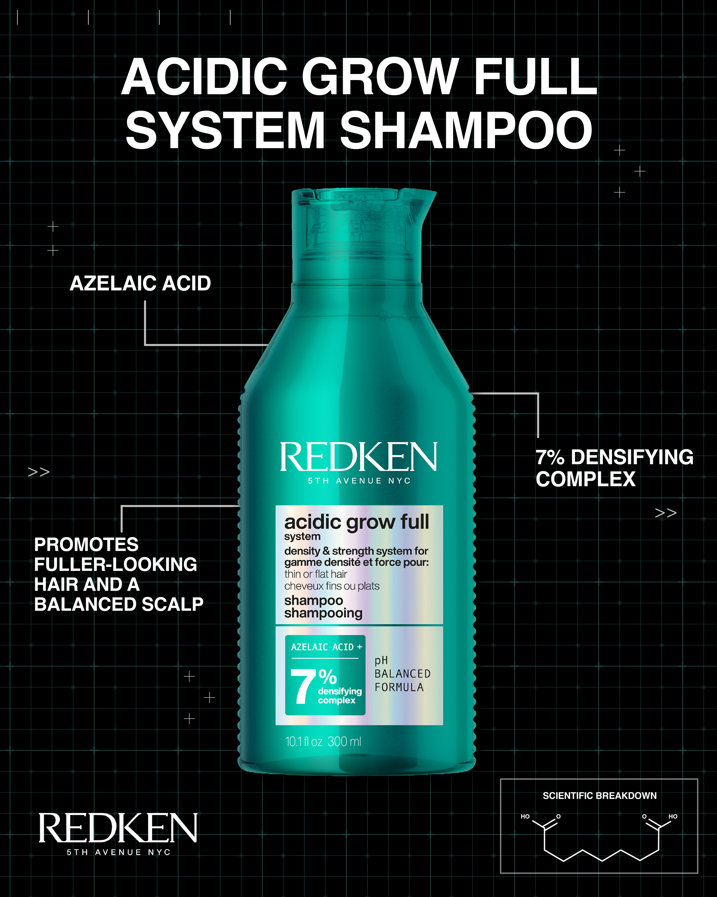
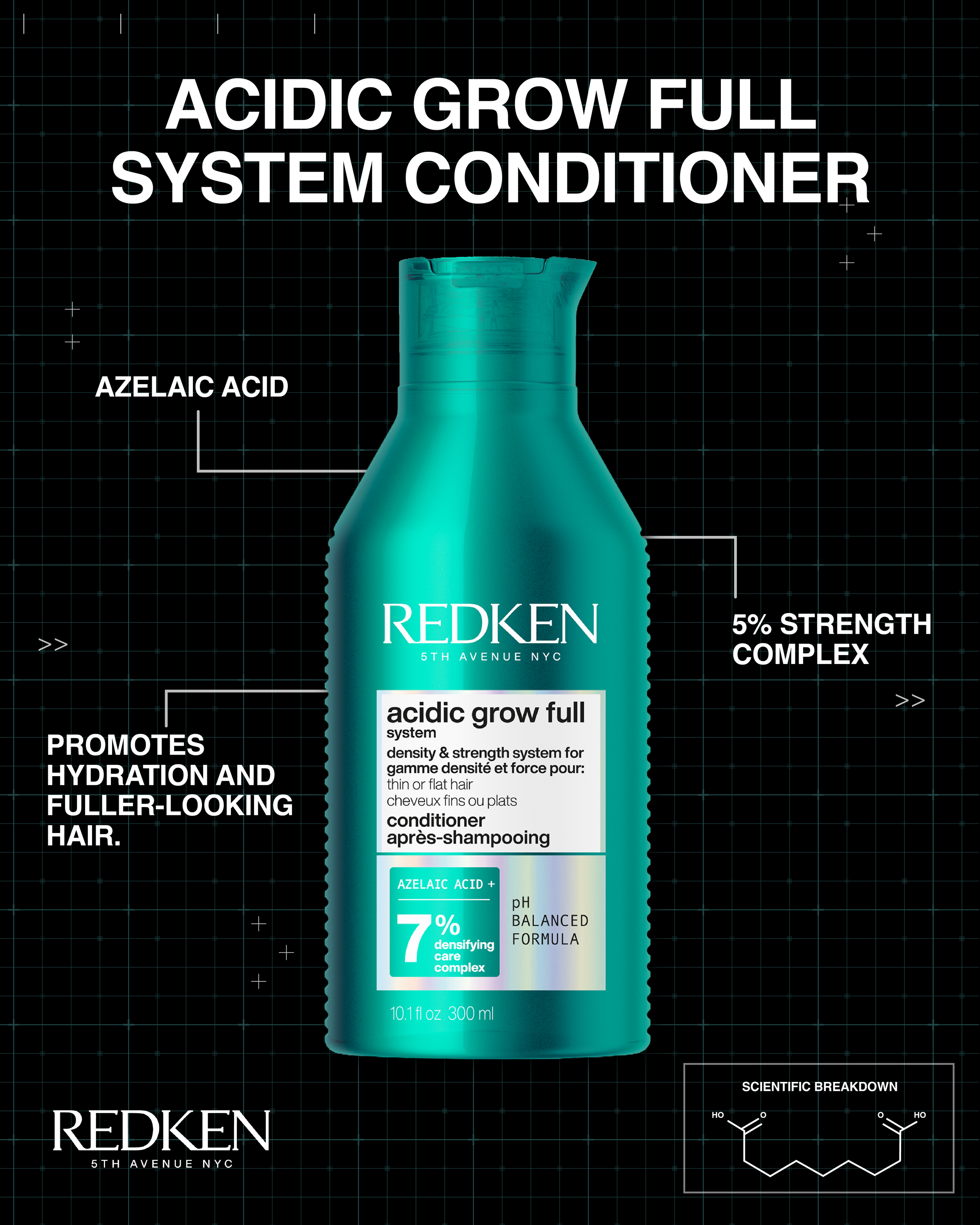
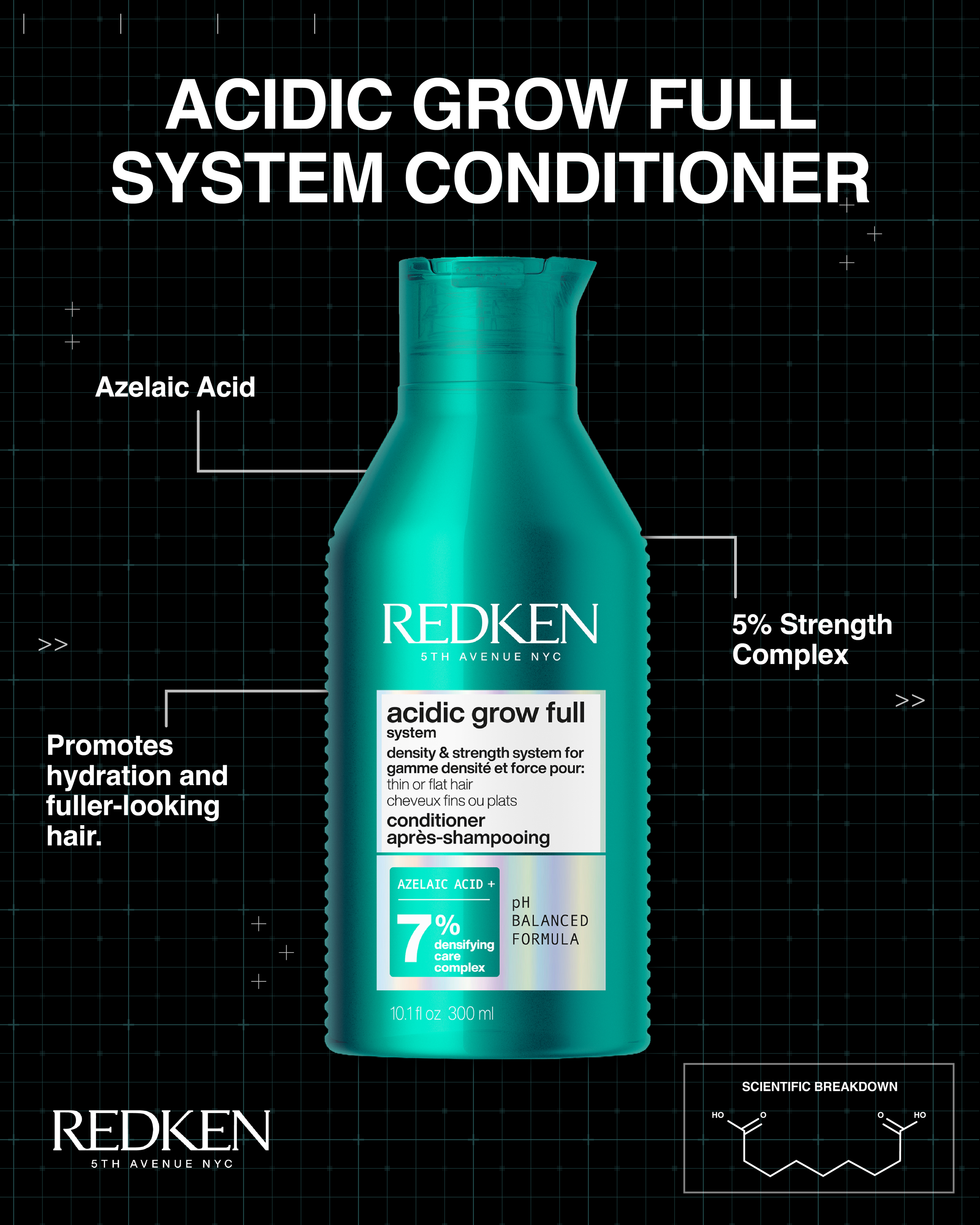
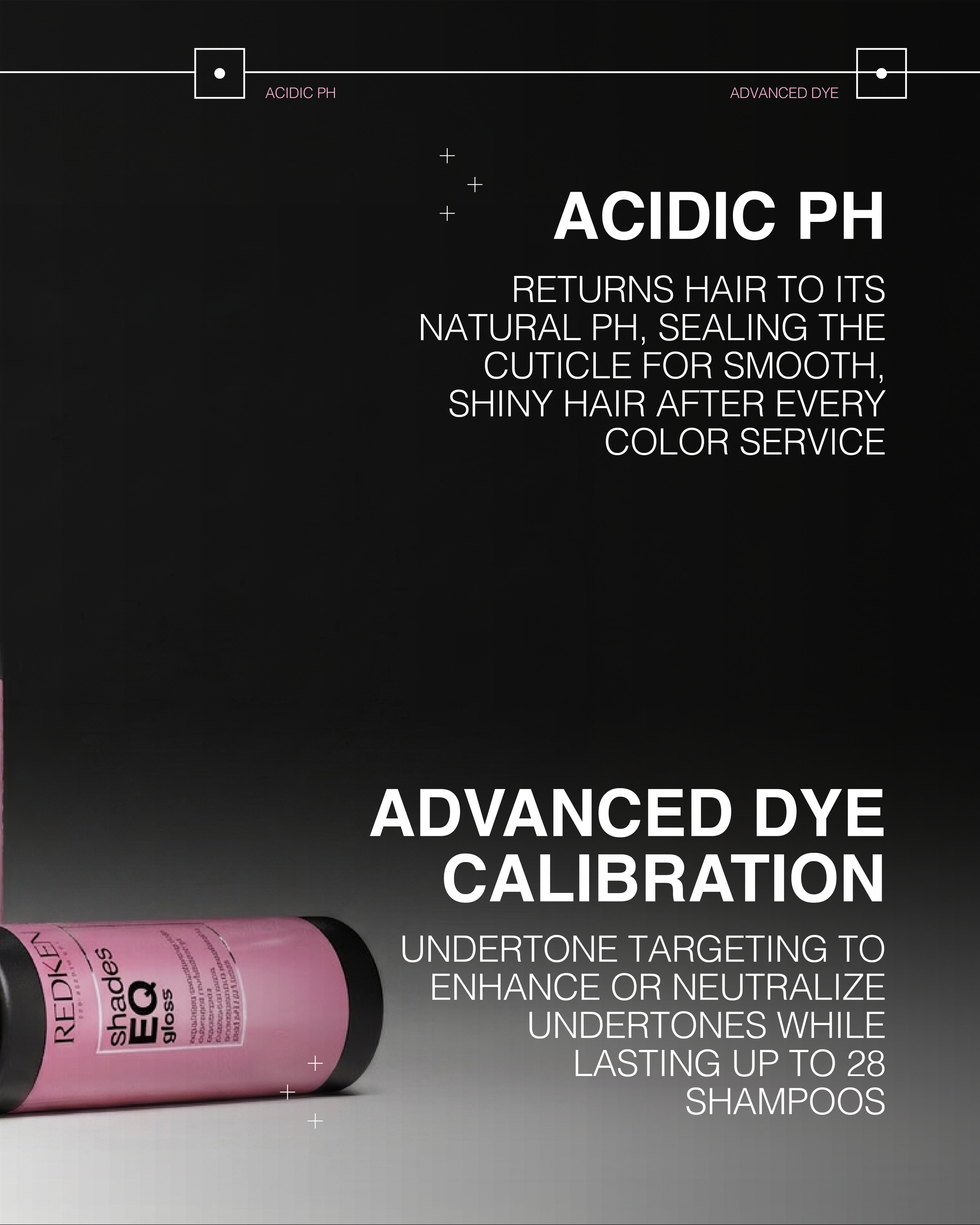
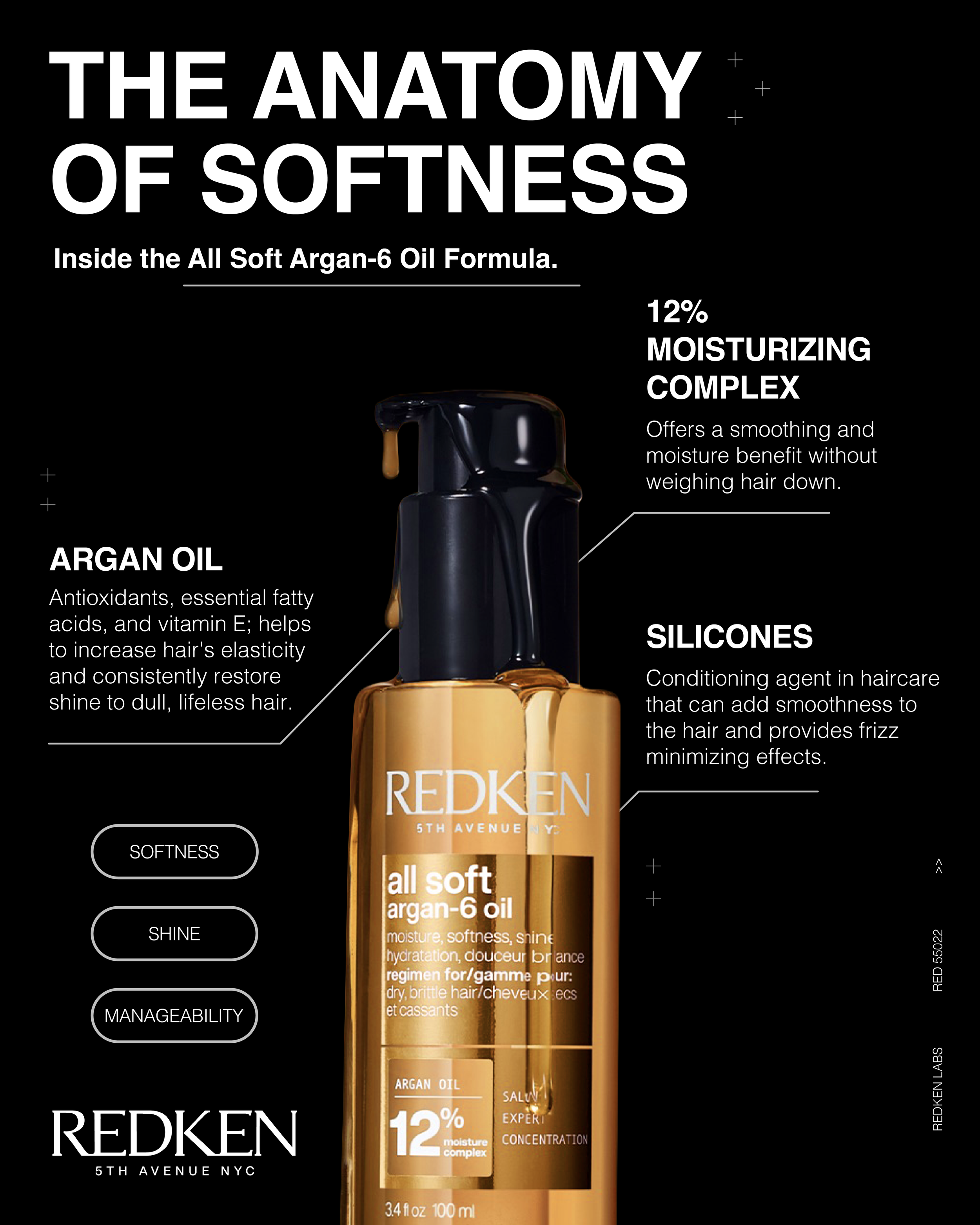
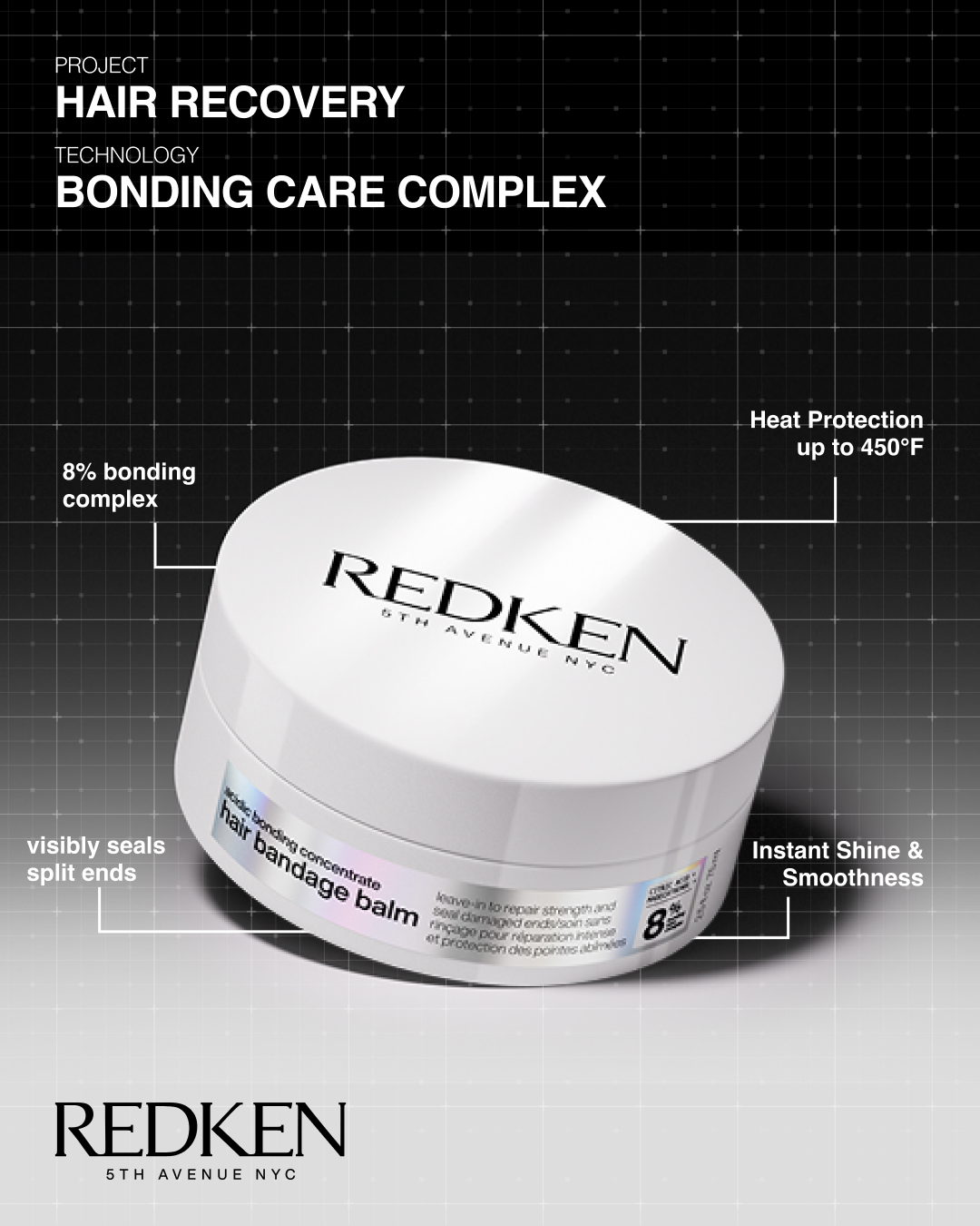
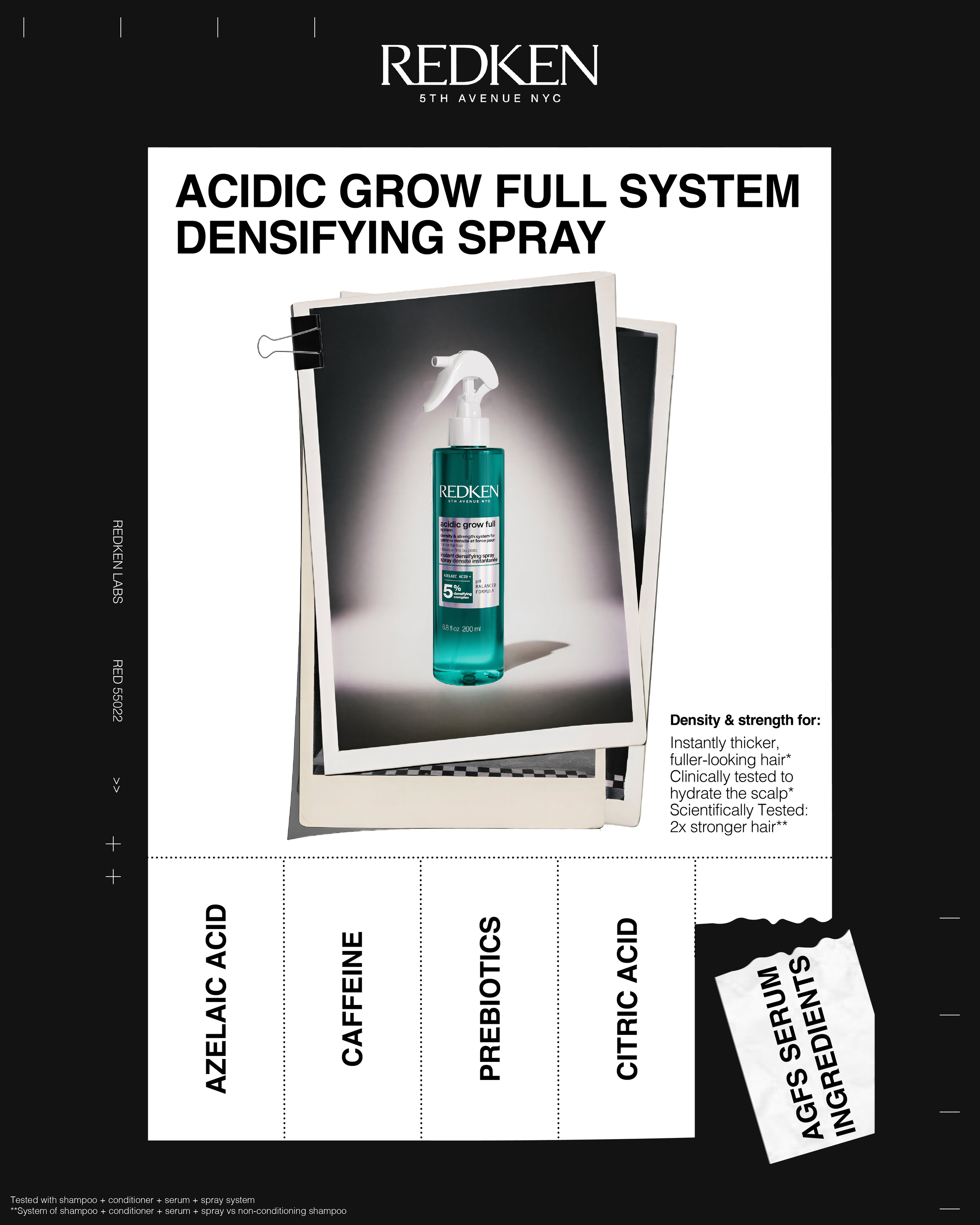
The Idea: showcase the scientific precision and ingredient efficacy of the AGFS Shampoo and Conditioner through a "Technical Blueprint" aesthetic. The objective is to educate the audience on the specific ingredient concentrations and core benefits of the AGFS routine using a clean, technical visual style.
The Visuals: This concept moves away from traditional lifestyle imagery to focus on a CAD-style, schematic layout that highlights the "molecular breakdown" of the products, reinforcing the brand's professional and science-backed authority. Ensure the visual cues flow with the aesthetics of the current brand theme.
Acidic Grow Full System
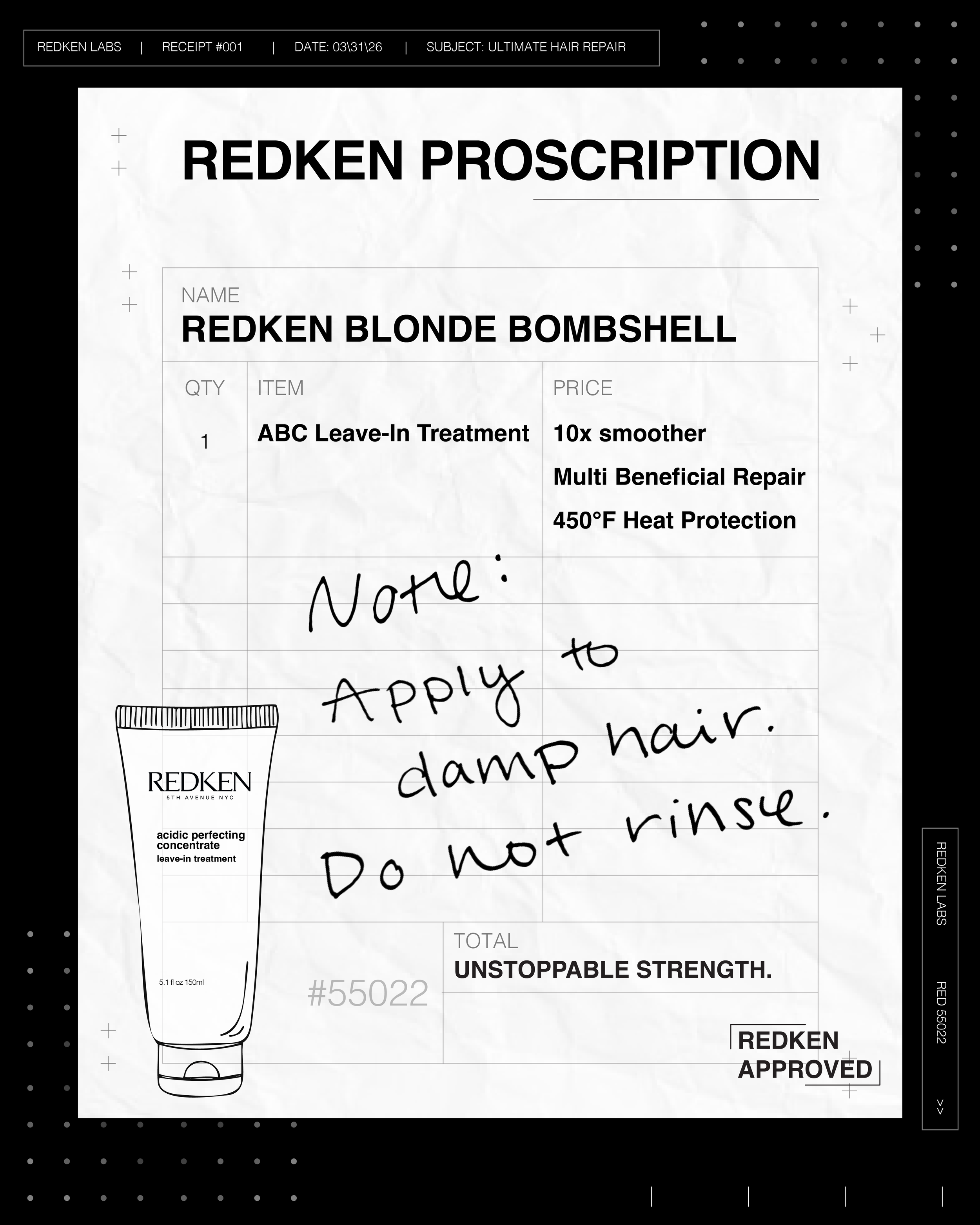
Redken Proscription
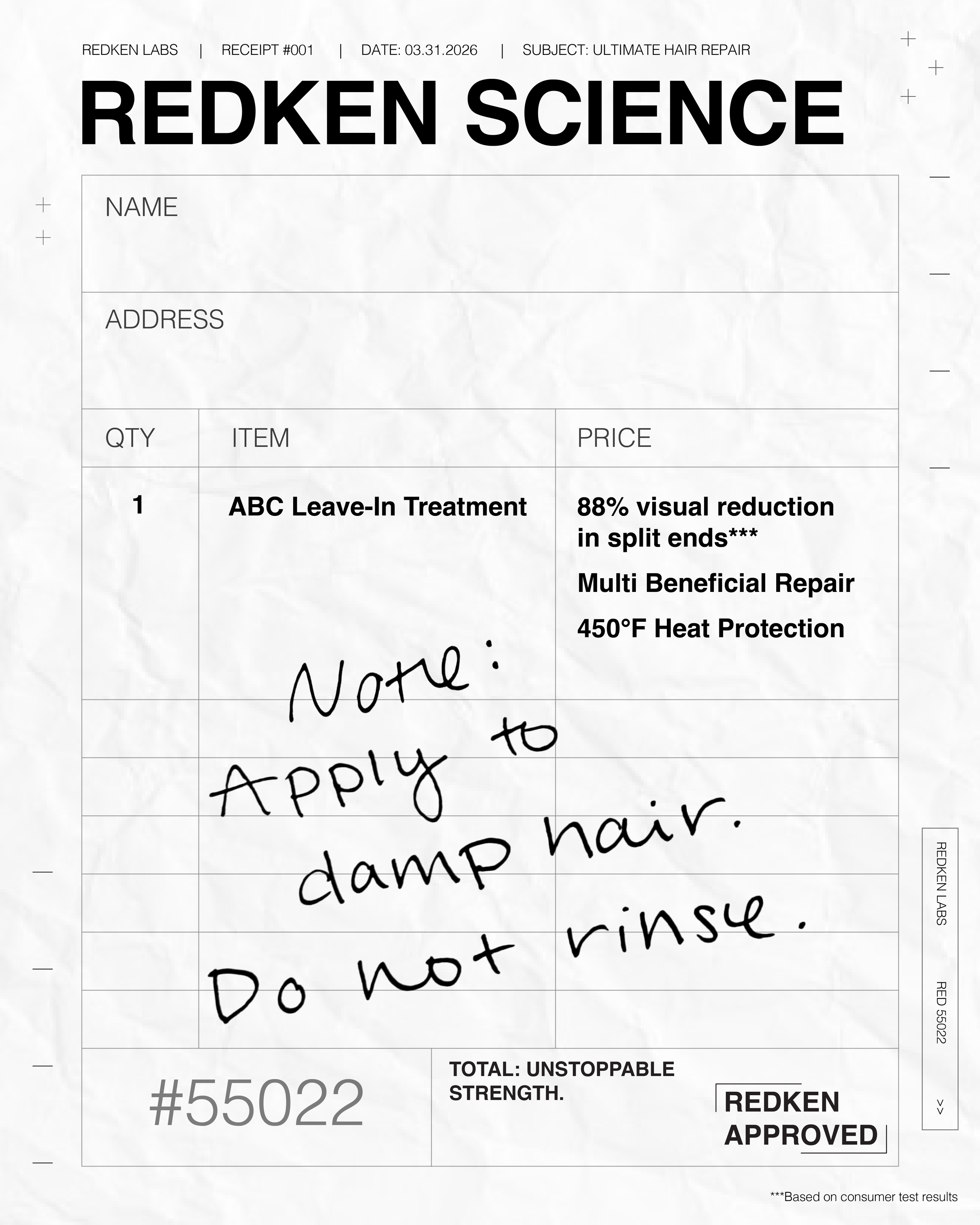
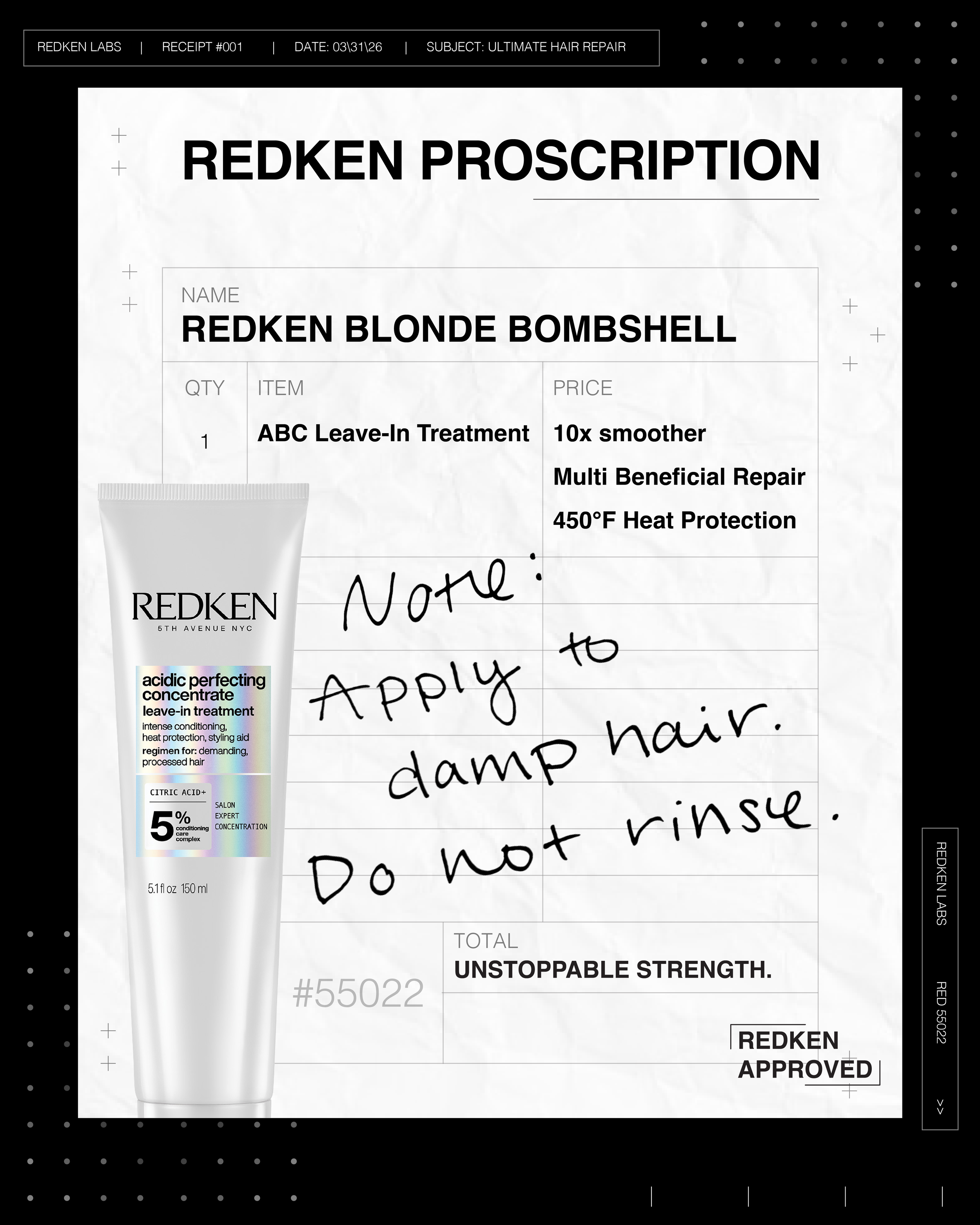
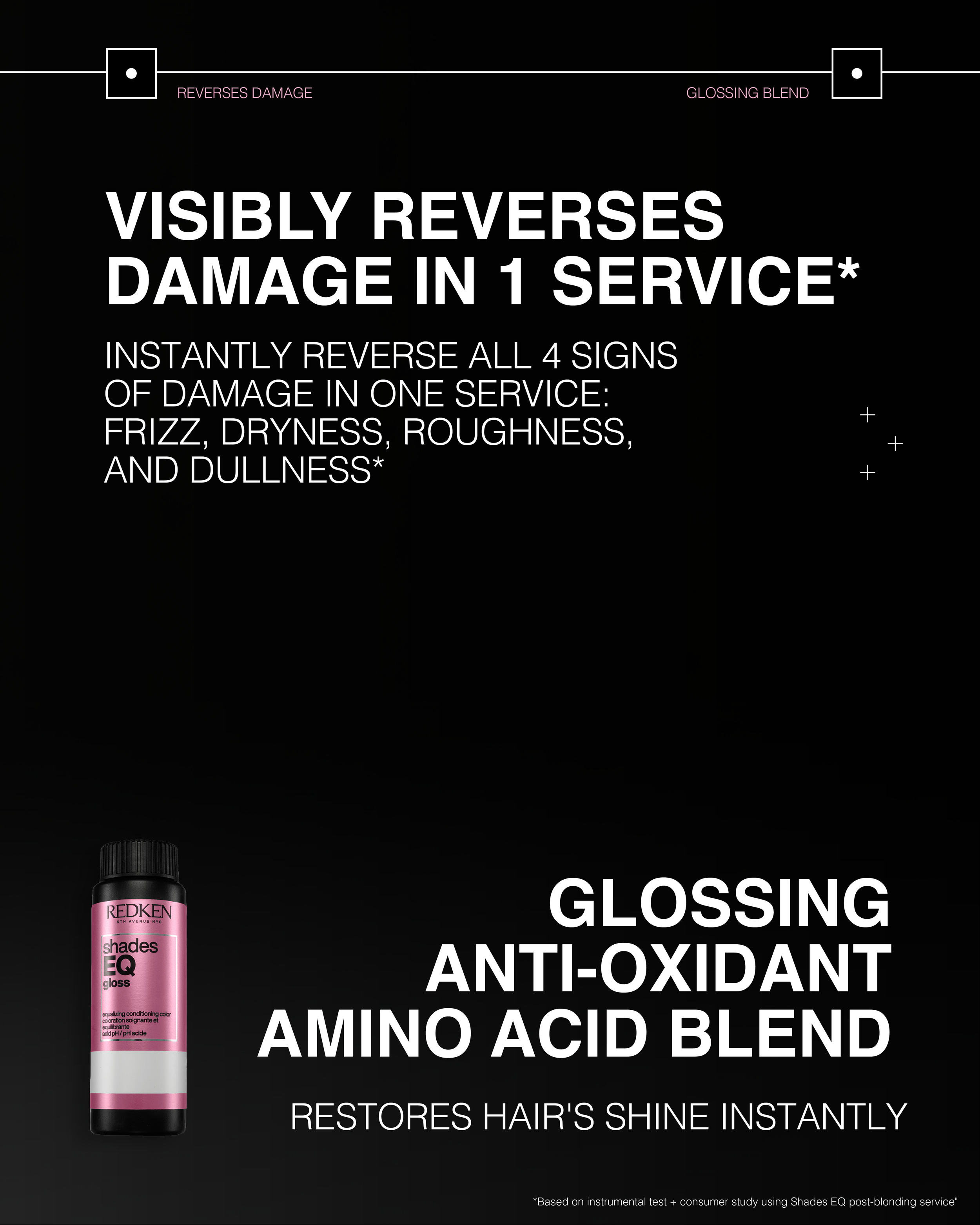
The Idea: Present the ABC Leave-In Treatment through an editorial "Redken Prescription"- style receipt. This concept uses the visual metaphor of an itemized transaction to list the product’s high-performance benefits.
The Visuals: To highlight the key clinical claims of the ABC Leave-In Treatment (split-end reduction, multi-benefit repair, and heat protection) in a creative, shareable static format. The aesthetic balances a vintage, high-texture paper feel with the modern, chic tech-edge of the ABC range, positioning the hair's transformation as a "confirmed" scientific result from the Redken Labs.
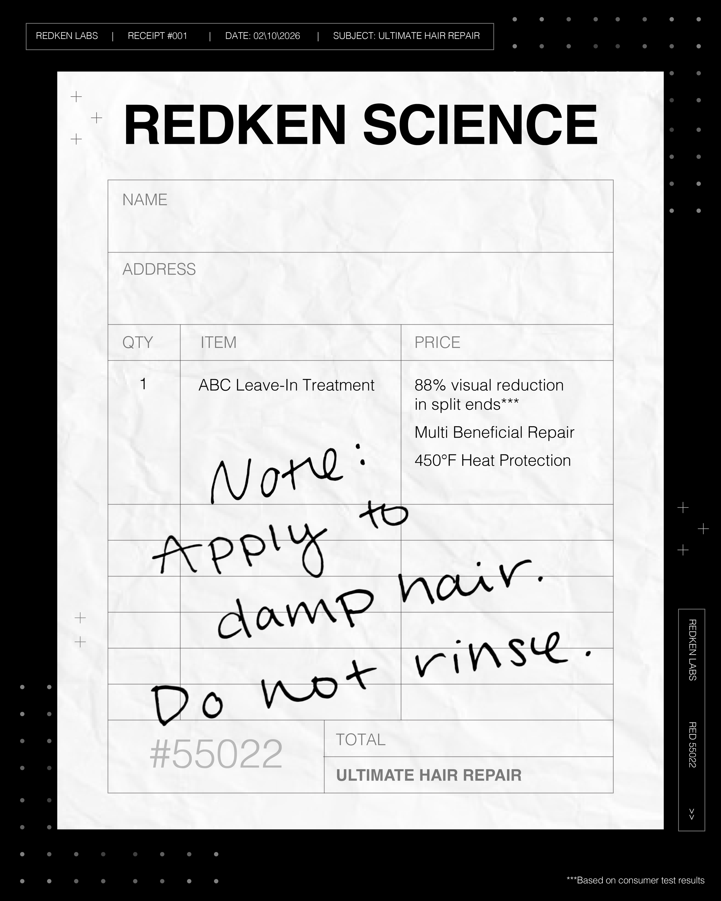
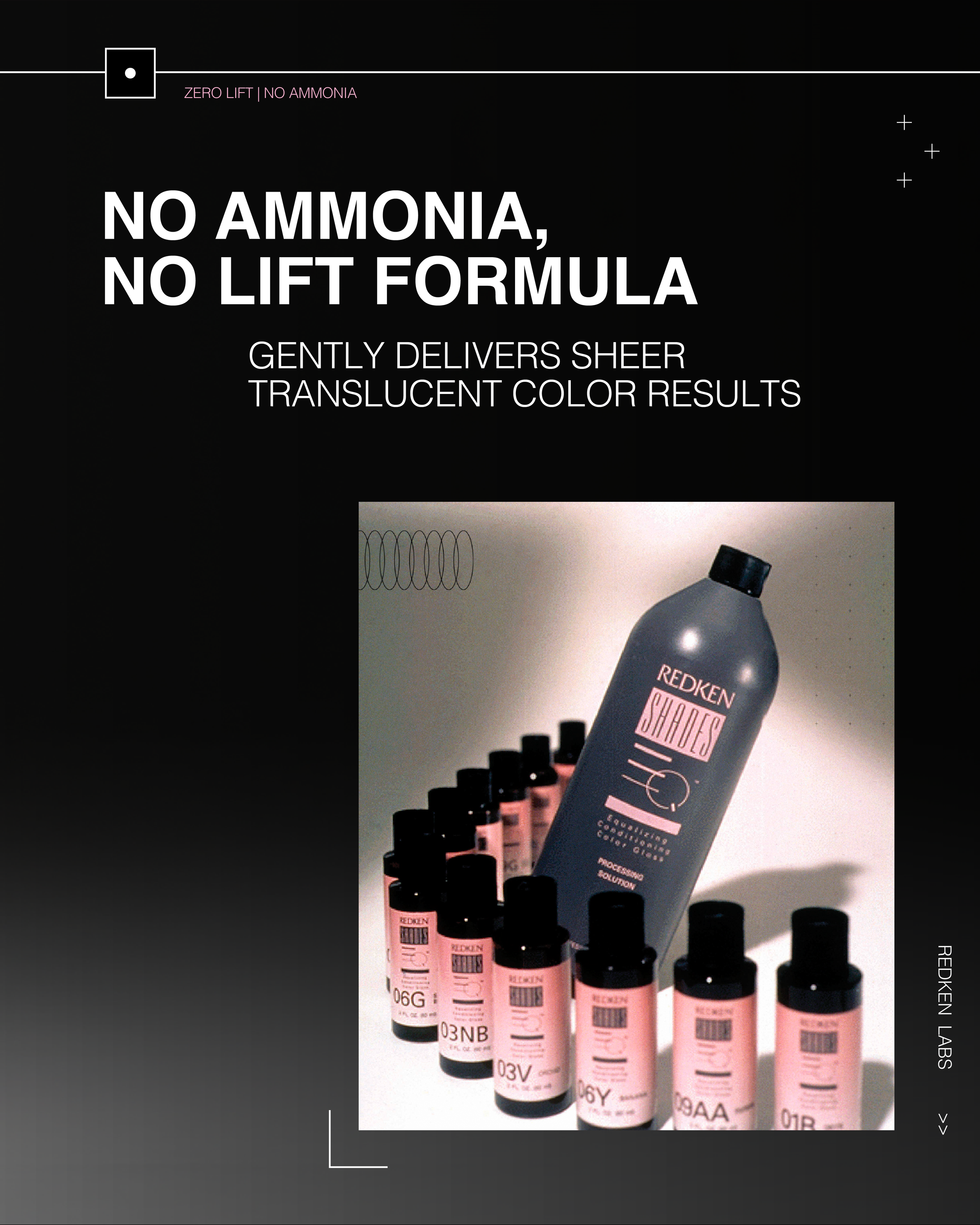
Previous versions.